Food Bank NYC
Overview
Mobile Site Redesign for Food Bank New York City’s Website.
Goal
Understanding and improving upon people’s experiences around finding and attending Food Bank NYC’s volunteering events.
Role(s)
UX Designer/Researcher
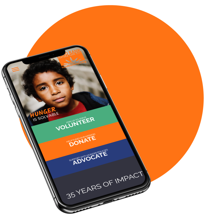
Hi-Fidelity Landing Page
Team
Caleb Ha
Jackie Rider
Peter Hsiao
Tools
Sketch
Figma
Methods
Screener Surveys • User Interviews • Persona Development • Journey Mapping • Design Studio Sketching • Wireframing • Prototyping • Usability Testing
Timeline
10 day sprint
Who’s the Focus?
In order to identify quality participants that reflect our target audience in the research, we crafted a screener survey to help narrow down potential interview candidates. We favored individuals with volunteering experience and who are regularly involved in their community.

Insights from Interviews
“I learn about volunteering events from other people”
Often times it appears that people who volunteer tend to get involved through their community, be it a place of work, a place of worship, or some other form of social connection (friends, classes, clubs, etc).
“I look for events that are trustworthy and have a good reputation”
When asked about what they looked for in a volunteering event or organization, all interviewees stated that they needed to verify the organizations reputation and credibility before they feel comfortable getting involved with them.
“I like events that are well organized.”
A good majority of our interviewees mentioned that they enjoyed attending events that were well organized as it gave them a greater sense of contribution and impact.
Target Defined
Julia is a representative of the target audience based on insights gathered from user research.

To better illustrate Julie’s pain points when it comes to researching volunteering opportunities, we constructed a journey map detailing potential areas of opportunity where design can improve upon her experience.
With the users pain points identified and the areas of opportunity outlined, we wanted to know…
How might we effectively communicate the credibility of FoodBankNYC and essential volunteering details on a mobile device?
Establishing a Baseline…
Now that the problem was identified, we needed to get a baseline understanding of how the current Food Bank NYC’s website currently performs in regards to these pain points. Since the majority of interviewees had reported using their phone as their main web browsing device, we prioritized mobile first in our initial usability tests and subsequent redesign processes.
What We Found
Existing Site Usability Test Results
4/5 users FAILED in finding details about upcoming volunteering events and how to get involved
1/5 users conducted 5 different searches, but found nothing
1/5 users tried unsuccessfully to return to the main page
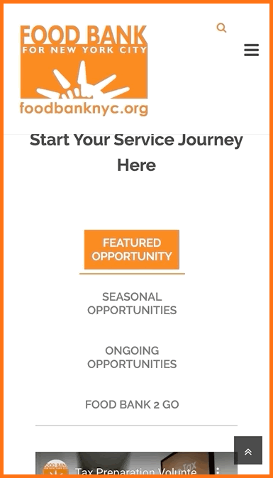
The crux of the issue centered around the volunteering page where our target users were unable to find where all of the upcoming volunteering opportunities are listed. Food Bank NYCs website promotes a variety of featured events that are scattered throughout the site making it difficult to identify where the focal point is.
If users could not find the upcoming volunteering events, they wouldn’t be able to acquire the event details either.
Interactive elements not suited for mobile viewports
Design Ideation
It became quickly evident that Food Bank NYC’s website was not optimized for mobile viewports. Key call-to-action links were hidden below the fold and required a lot of scrolling on part of the user.
Discoverability of call-to-action links related to volunteering were prioritized throughout our design studio sessions and early wireframes.
The most significant navigation issues were found on the volunteering page. As seen in ‘Current Site’ on the right, mobile viewports show image elements overlapping with the text on the each link. Furthermore, the links themselves do not appear to be clickable links in the conventional sense. Lastly, the most important section for finding volunteering events, as portrayed in this image, is located towards the bottom of the page, making the task of discovering it all the more difficult.
The mid-fidelity iteration brought a clear call-to-action button for upcoming events to the top of the page.
Mid-Fidelity Testing
6/6 users successfully found details about upcoming events and how to volunteer
6/6 users said the task was easy to complete
The mid-fidelity prototype addressed many of the pain points identified from the initial usability testing. The key pages of the website were now more easy to discover and the call-to-action was now easily identifiable to users.
Moving forward in our iterations we knew we needed to keep the same level of discoverability while integrating colors and content from Food Bank NYC.
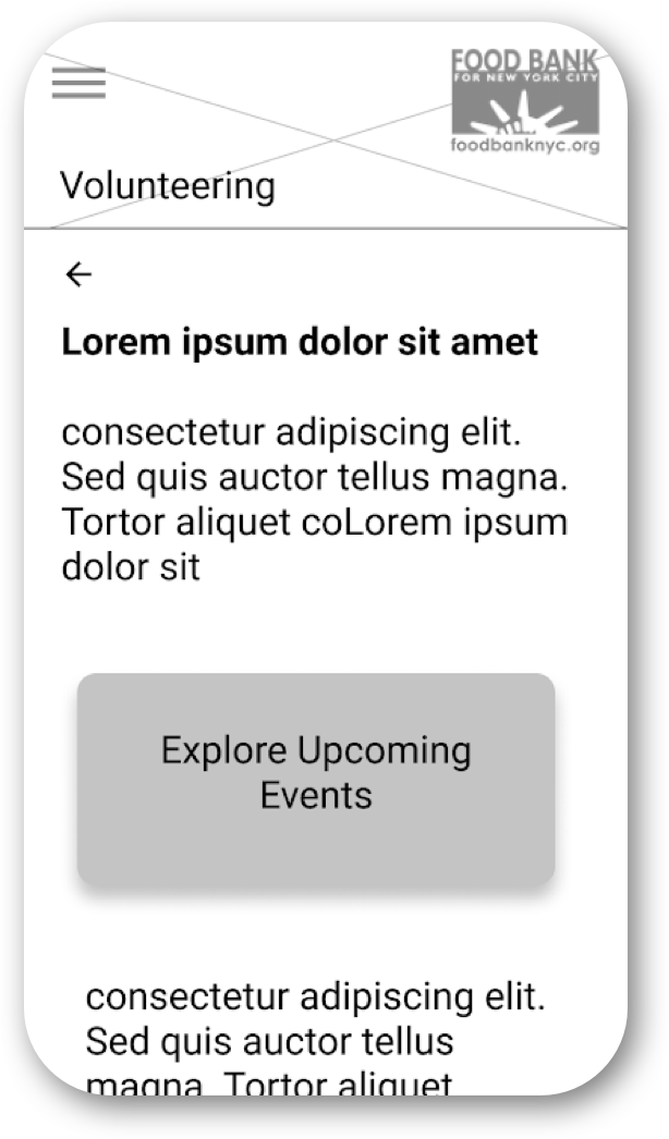
Mid-Fi Volunteering Screen
Hi-Fidelity Prototype
Next Steps
Testing and iterating upon the desktop breakpoint
Examining and optimizing the user flow for the sign up process itself
Handoff and working with developers
My Takeaways
Good communication is key when it comes to all aspects of the design process. Spending a little time making sure the team is on the same page will save a lot of time later on in the design process.
It’s more important focusing on first delivering a minimum viable product before getting bogged down with extraneous feature ideation and less significant design details.